So things may be quiet here for a bit while I build up a little stock for an online store. I’m currently experimenting with using stamps to put quotes on original drawings for sale. I’m using stamps because my handwriting is neither precisely neat nor interestingly messy in any way.
My first venture has an unhinged kidnapper’s ransom note look to it, which is not what I was going for. So, I’m giving it away on Instagram to anyone who promises that they like it enough to hang it up on their wall. Follow me over there (@devon_isadevon) if you’re into that kind of thing, and you could “win” it. I’m not sure anyone will even want it, so I’m using the word win loosely. You can “enter” on Facebook too – https://www.facebook.com/masterofliterature.
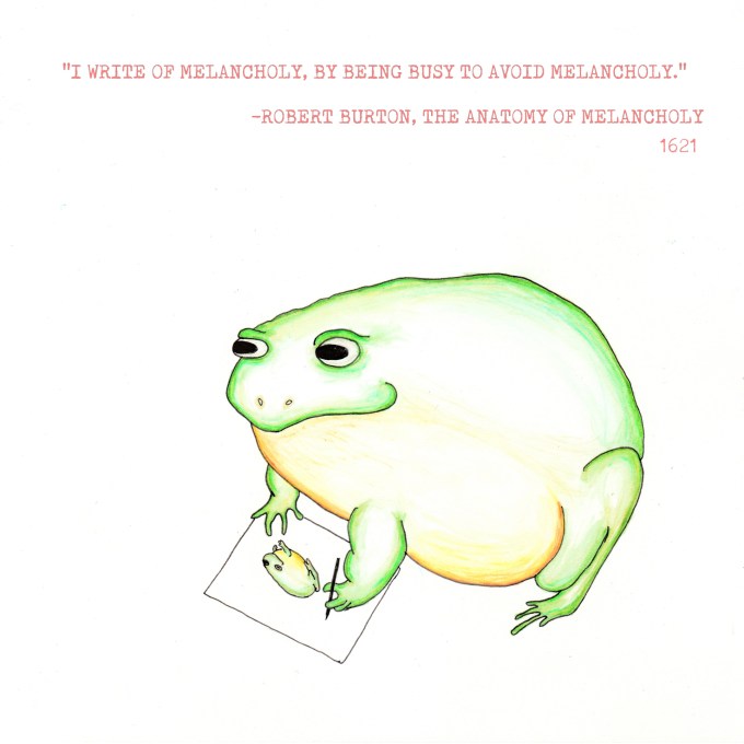
The next step is to invest in some connectable stamps to eliminate the ransom letter look, so before I buy, I’m trying to decide between ALL CAPS or not all caps. I have posted some mock-ups here along with the ransom note version that I’m giving away. Opinions welcome! I like all caps, but in general, I think most people do not enjoy SO MUCH SHOUTING. I’d like the text to be smaller than pictured here if I can find very tiny stamps, but maybe I’m being obsessive.
Also, do people like having Burton’s name in there? Or just the quote? I prefer including his name, but I guess if it’s not on there, then people will ask you about the quote and you can sound erudite when you explain that it is from a 397-year-old 1300 page book that no one reads by some guy whose name you can’t remember. I left out the title of the book, because I can’t find italic stamps, but again, maybe I’m being a little fussy… Okay just one two more mock-ups, and then I’m done:
(I think the last one is almost okay!)

I like it!!!
Thank you so much!!!!